Advanced analytics

Main page - general overview regarding functionalities

Gadget which allows you to view your data via Dependancy wheel

Gadget which allows you to view your data via Sankey diagram

Gadget which allows you to sum up data and display result in a bar chart

Gadget which allows you to sum up data and display result in a pie chart

Gadget which allows you to sum up data and data in a 2-d table
Sum up data using Bar chart gadget
Create tables containing data with multiple statistics. With this functionality, you can analyse whatever you need to.
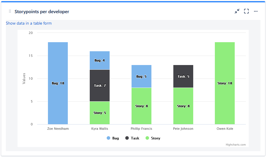
Typical usage of the Bar chart is to view progressive statistics over a time period, so that you can check whether the trend of the data is desired, or not (increase, decrease or stabilization). Such example could be summing up amount of Story Points burnt per Sprint, count of items aiming for a certain release, or count of different work items in your product backlog. You can also compare how many Story points there are in each release – to prevent snowball effect (increasing load in each release), to ensure you’re still building an MVP.
Configuration
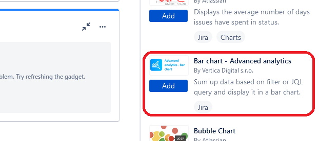
- Go to dashboard on which you're willing to place the Gadget
- Add Gadget called "Advanced Analytics table (filter/SQL)" to the dashboard
- Fill in the details on the gadget configuration screen
- Saved filter (optional)
- JQL - select data you want to show in the table
- Fields to sum - select data to sum up
- Rows values from - select data to be shown on the y axis (vertical)
- Columns values from - select data to be shown on the x axis (horizontal)
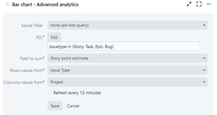
4. Click on button "Save" and now you see statistics you wanted :)