Advanced analytics

Main page - general overview regarding functionalities

Gadget which allows you to view your data via Dependancy wheel

Gadget which allows you to view your data via Sankey diagram

Gadget which allows you to sum up data and display result in a bar chart

Gadget which allows you to sum up data and display result in a pie chart

Gadget which allows you to sum up data and data in a 2-d table
Sum up data using Sankey diagram gadget
Create a chart that shows dependencies between teams, bugs on each test environment generated by each team,... you got the idea!
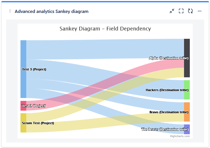
Sankey diagram may seem like a sophisticated chart, fortunately it’s not. It can help you understand the flow of work running through your delivery system (the how) with a blink of an eye. This will enable you to perform systematic improvements going forward. It can also help you to coordinate dependencies between teams providing an easy to read visual representation of which team needs to cooperate with another team - in order to deliver their product, or feature.
Configuration
- Go to dashboard on which you're willing to place the Gadget
- Add Gadget called "Advanced analytics Sankey diagram" to the dashboard
- Fill in the details on the gadget configuration screen
- Saved filter (optional)
- JQL - select data you want to show in the table
- Field - select the fields you want to display in the table - you can sum values here, or just do a count. This field works as the connector between both nodes
- Source - nodes on the left side
- Destination- nodes on the left side
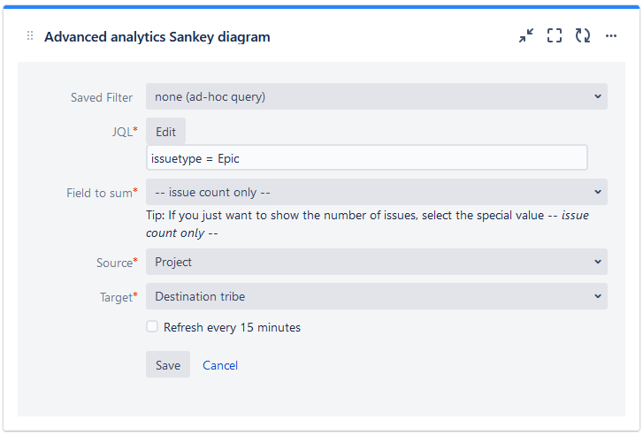
4. Click on button "Save" and now you see statistics you wanted :)